Simple Web Layout with CSS Grid
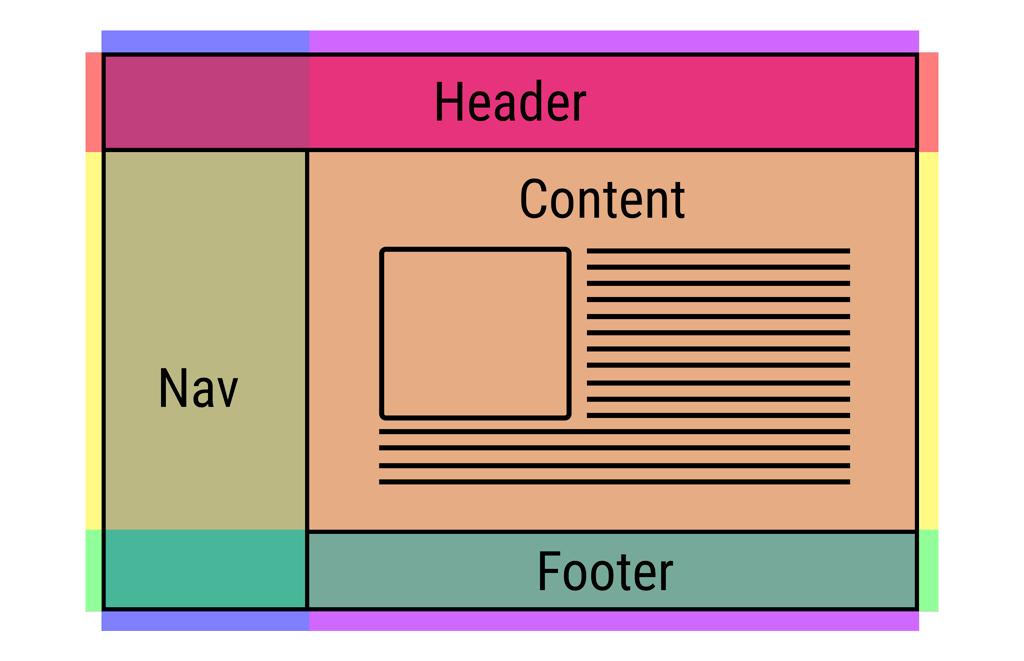
Recently, I had a chance to work with CSS Grid Layout. To be honest, I was astonishing by how easy it is to manipulate the web layout for multi-devices.
Without any frameworks, I can determine how the layout should be on desktop, tablet and mobile in just few lines of code. It is also extremely easy to understand the structure of the HTML and CSS. We don’t have to change the structure of the HTML at all.
The HTML structure is always the same.
<div class="container">
  <header>HEADER</header>
  <nav>NAV</nav>
  <main>MAIN</main>
  <aside>ASIDE</aside>
  <footer>FOOTER</footer>
</div>
For the container, we just need to determine the number of rows and columns. I really don’t want to go to the detail of all the technical terms. It can be found all over the internet such as from Mozilla or GridbyExample.
.container{
  display: grid;
  grid-template-rows: 1fr 5fr 1fr;
  grid-template-columns: 2fr 5fr 3fr;
  grid-template-areas:
    "header header header"
    "nav main aside"
    "footer footer footer";
  grid-gap: .75em;
}
Then we can set the position of all the elements under container.
header{
    grid-area: header;
    background-color: teal;
}
nav{
    grid-area: nav;
    background-color: tomato;
}
main{
    grid-area: main;
    background-color: lightblue;
}
aside{
    grid-area: aside;
    background-color: orange;
}
footer{
    grid-area: footer;
    background-color: lightgreen;
}
For different layouts on different devices, we just need to restructure the rows and columns.
// For tablet viewers
 @media(max-width: 768px){
    grid-template-rows: 1fr 1fr 5fr 1fr;
    grid-template-columns: 2fr 5fr 3fr;
    grid-template-areas:
    "header header header"
    "nav nav nav"
    "main main aside"
    "footer footer footer";
 }
And for mobile devices, we actually don’t have to do anything. Keep in mind that you always design for mobile first.
@media(max-width: 480px){
    display: block;
}
Voila! Now you have a great simple layout with only few line of codes thanks to the power of CSS Grid.
You can play around with this through my Codepen.io:
Although that CSS Grid won’t support all the browsers at the moment, however, there are plenty of methods that you can improve. Don’t let it prevent you from joining the pack ;)


0 comentarios:
Publicar un comentario